Fast Gallery + Clean Builder

Styled Text Font StyleGenerator

Build bold, script, bubble, gothic, and clean Unicode styles in seconds.Read more

How this styled text tool works

Input text
profile text idea
1 lineLive preview
1

Type plain text first

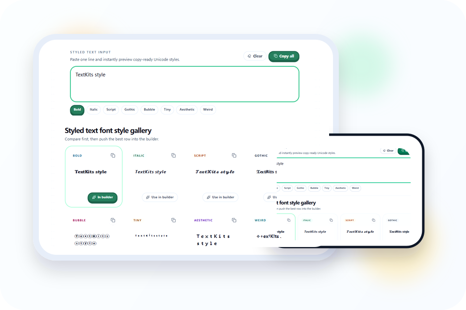
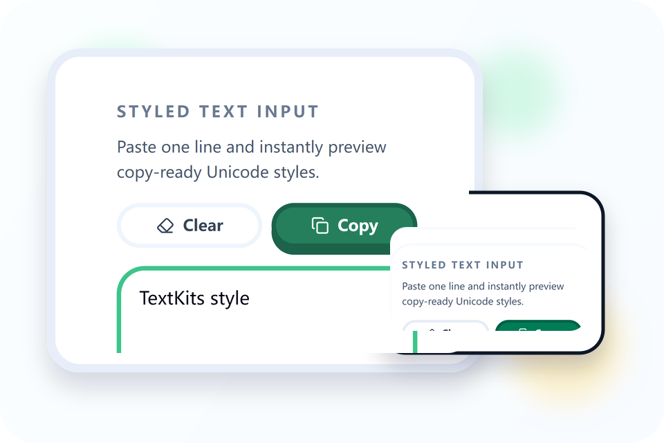
Enter one short line in the styled text input. The eight gallery rows and the builder preview update from the same source, so you can compare text styles without retyping the phrase.

Style gallery
BoldScriptBubbleWeird
Start with the row that already feels close to the final answer.
2

Pick the closest base style

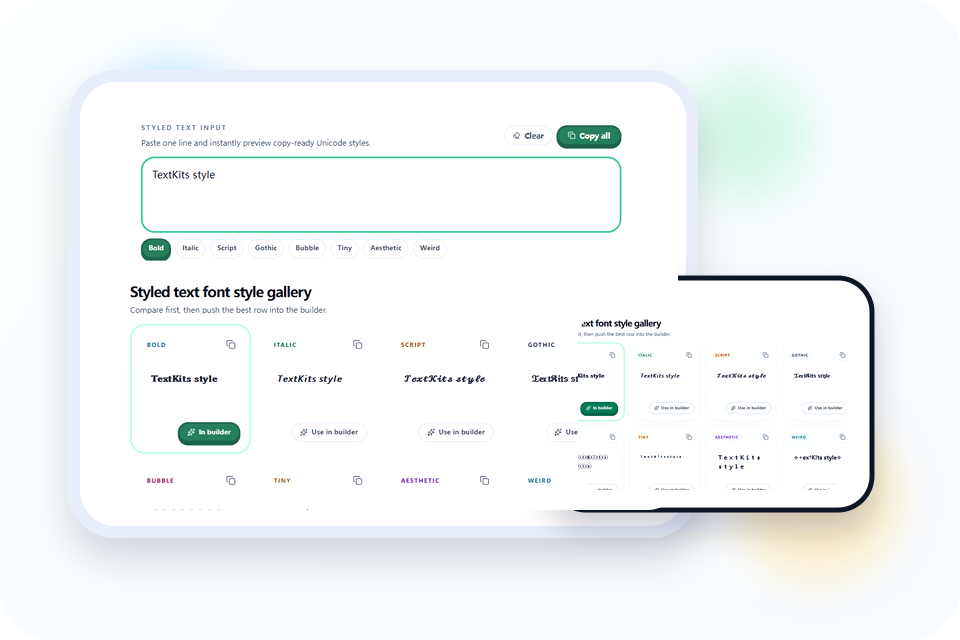
The gallery always returns Bold, Italic, Script, Gothic, Bubble, Tiny, Aesthetic, and Weird. Select Use in builder on the row whose letter shapes are closest to your intended result.

MixWrapSeparatorEmoji
♡ 𝐩𝐫𝐨𝐟𝐢𝐥𝐞 ~ 𝐭𝐞𝐱𝐭 ♡
3

Tune the builder only if needed

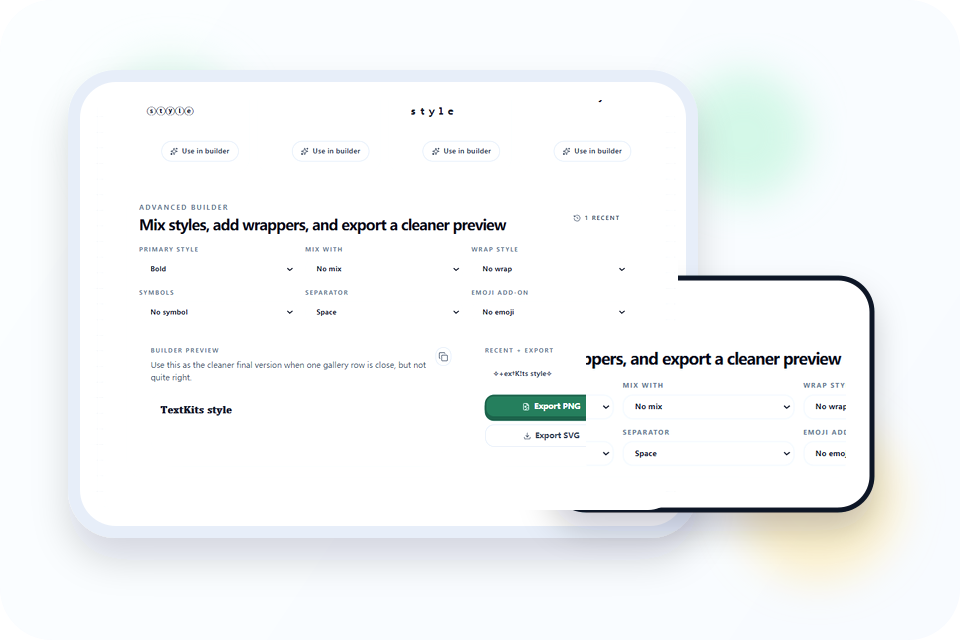
The builder offers eight Primary styles and nine Mix choices including No mix, plus five Wraps, five Symbols, five Separators, and six Emoji add-ons. Mix alternates complete words, starting with Primary; it does not alternate individual letters.

Final actions
𝐩𝐫𝐨𝐟𝐢𝐥𝐞 𝐭𝐞𝐱𝐭
ⓟⓡⓞⓕⓘⓛⓔ ⓣⓔⓧⓣ
CopyExport
4

Copy or export the final result

Copy one row, copy all eight labeled gallery rows, or copy the builder result. A copied or exported builder result enters Recent, where this browser keeps the six newest distinct outputs. PNG and SVG export create a 1200 × 630 visual preview.

What makes this styled text workflow worth using

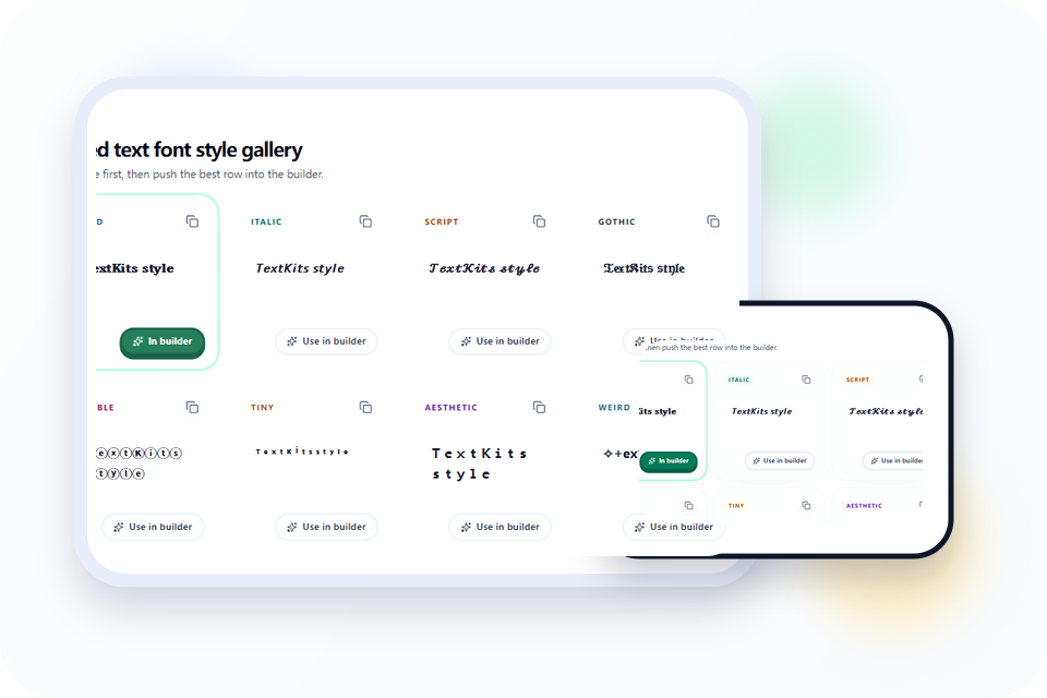
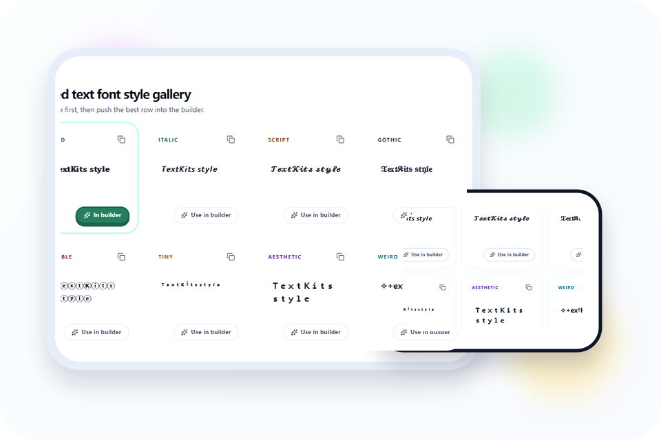
Gallery preview showing multiple text style rows from one phrase

Why this styled text page feels more useful

The styled text font style gallery is a fixed comparison, not an endless generated list. With “Abc XYZ 123,” all eight rows produced different output: Bold and Bubble changed both letters and digits; Italic, Script, and Gothic left the digits plain; Tiny raised the supported characters but kept X, Y, and Z full size; Aesthetic used fullwidth letters and digits; Weird added its readable symbol treatment.

Use that evidence to choose a base style instead of judging only the label. The gallery is the fast path for styling text; the builder is only for a row that needs word-level mixing or a frame. This narrower workflow keeps the page distinct from the Custom Text Generator which is designed for browsing a much larger recipe space.

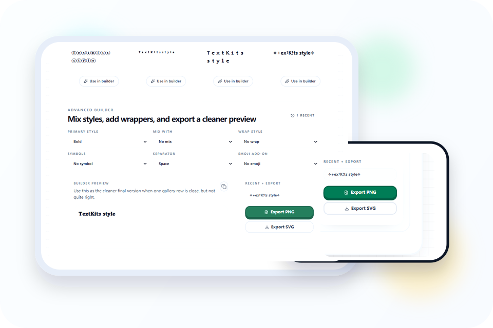
Builder controls for wraps, separators, and mixed text styles

Use the builder when the base style is close but not finished

Mix alternates whole words: the first, third, and fifth words use Primary, while the second and fourth use the selected Mix style. The chosen separator replaces the whitespace between those words. Symbols sit immediately around the styled line, Wrap sits outside the symbols, and Emoji is the outermost layer.

For example, “hello world again” with Bold, Italic Mix, Mid dot, Heart, Brackets, and Sparkles becomes “✨ [ ♥ 𝐡𝐞𝐥𝐥𝐨 · 𝑤𝑜𝑟𝑙𝑑 · 𝐚𝐠𝐚𝐢𝐧 ♥ ] ✨”. If you want one consistent alphabet, leave Mix at No mix and use only the separator or outer decoration you need.

Styled text preview panel showing copy and export buttons

Preview first so the copied text still feels readable later

Copy all creates an eight-line bundle with each gallery label before its output. Copying one row or the builder writes only that selected result. Successful builder copies and exports are saved in Recent in this browser; duplicates move to the front and the list stops at six. No account or server-side history is involved.

Export PNG and Export SVG turn the builder result into a 1200 × 630 graphic preview. The SVG includes at most four non-empty lines. Use copy when the destination needs actual Unicode text; use export only when you need a visual asset, because an exported image is not a substitute for searchable, editable text.

Practical tips for better styled text results

Bold, script, bubble, and aesthetic text style examples

Best style families when readability matters most

Start with Bold when letters and digits both need a strong, consistent mapping. Bubble also maps the tested digits, but circled characters take more horizontal space. Italic, Script, and Gothic preserved 123 in the tested sample, while Tiny kept unsupported capital X, Y, and Z at normal height. Preserving unsupported characters is safer than inventing lookalikes, but it can make a row visually uneven.

Keep the source phrase nearby and paste-test the chosen styled text in the destination. Font coverage, line height, character limits, and screen-reader pronunciation vary by app and device. Use plain text for search terms, account recovery details, or any message whose exact reading matters.
Examples of geometric and boxed Unicode text styles

When this page can double as a square text generator

Bubble creates circled Unicode letters and digits; Bracket and Chevron Wrap frame the whole line. Those controls can satisfy a broad geometric-text request, but they do not create square tiles behind every word and they do not turn the result into a logo.

If you need solid boxes or printable letter tiles, use the Boxed Text Font tool. Staying here is appropriate when circled characters or a simple outer frame are enough and the result still needs to copy as text.

Decorative Unicode text alongside its plain text equivalent

How to convert decorative text back to normal

Keep the original plain phrase before styling. Some mathematical Unicode letters can be mapped back reliably, but decorative symbols, emoji, wrappers, lookalike alphabets, and unsupported characters do not encode a complete styling history.

Use the Convert This Font to Normal tool for supported decorative letters, then review any symbols or wrappers that remain. It can recover recognizable characters; it cannot reconstruct the exact source formatting or infer every lookalike.

Styled text generator on a narrow mobile screen with short text and copy buttons

How to keep styled text clean on mobile screens

Fullwidth, circled, wrapped, and emoji-heavy results consume more visible space than the plain source. Test a short name or caption at the actual field width, and remove Emoji, Wrap, or Symbols before abandoning a readable base style.

Also check the pasted result rather than trusting this preview alone. A destination can clip unusual line height, replace unsupported glyphs with boxes, or count Unicode characters differently. Keep a plain-text alternative for accessibility and for fields that reject decorative characters.

Styled text font style FAQ

Common questions about copying styles, keeping text readable, and converting back to plain text.

Is this a real font download?

+
No. This tool creates decorative Unicode characters that you can copy and paste right away. You are not installing a font file or changing your keyboard. That makes it fast for bios, captions, names, and short posts, but support still depends on the app or device that will render those Unicode characters.

Where does the copied styled text usually work best?

+
It works best in short text fields where Unicode styling is commonly supported, such as social bios, profile names, captions, status lines, and lightweight promotional copy. Very long paragraphs are less reliable and harder to read. If a platform renders the style poorly, switch to a cleaner option like bold, bubble, or fullwidth before copying again, then test the pasted result once in context.

Can I use this page like a square text generator?

+
Yes, in a practical sense. Many people use this page when they want circled, boxed, spaced, or geometric Unicode looks without opening a separate design tool. Bubble, gothic, and aesthetic variants are usually the closest match when you want decorative shapes that still stay copy-ready, readable, and easy to reuse in ordinary text fields.

Can I turn decorative text back into normal text?

+
Yes. This page handles the styling step first, so the safest workflow is to keep your original phrase plain, generate only as much decoration as you need, and save the clean source text somewhere nearby. If you later need to reverse the output, paste it into a plain-text recovery tool to convert the decorative characters back into something easier to edit.

How do I keep styled text readable on mobile?

+
Start with shorter words, choose one primary style, and add extra symbols only after the base text already looks clear. Strong decoration can collapse on narrow screens, especially in usernames or tiny UI labels. The safest workflow is to preview, copy, paste into the target app, and then step back to a simpler style if readability drops or the spacing tightens too much.

Should I copy one row or use the builder first?

+
Copy one row when the gallery already shows a version that feels finished. Use the builder when the shape is close but you still need cleaner spacing, a lighter wrapper, or a second style mixed in. That keeps the workflow fast: compare first, refine only when necessary, and avoid over-editing decorative text that was already working.