Input text
profile text idea
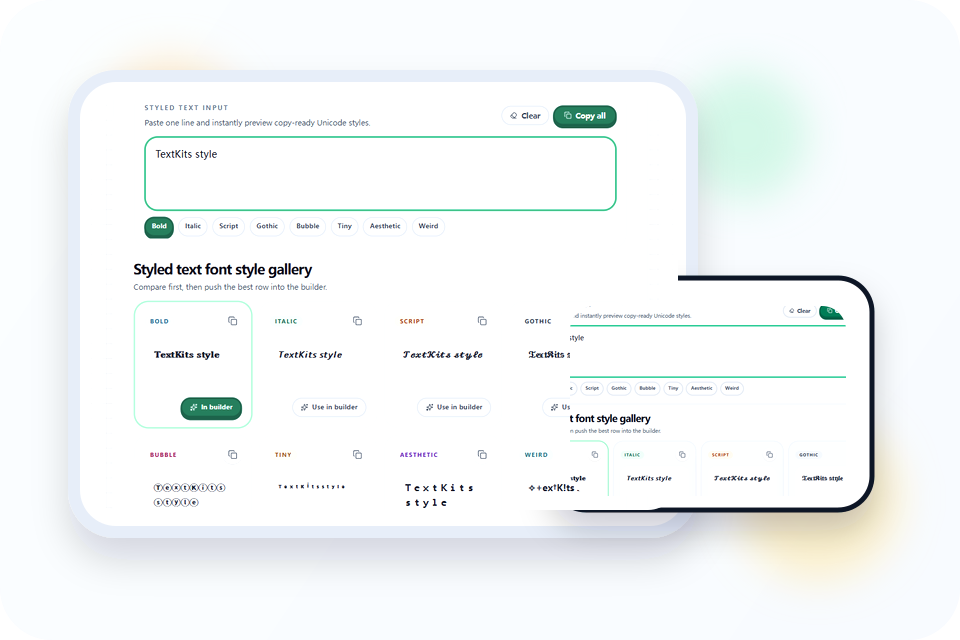
1 lineLive preview
1
Type plain text first
Enter the short phrase you want to restyle. The gallery updates immediately so you can judge the shape before adding anything decorative.
Fast Gallery + Clean Builder
professional enough for bios, captions, gamer tags, and polished social copy.
Enter the short phrase you want to restyle. The gallery updates immediately so you can judge the shape before adding anything decorative.
Choose bold, script, gothic, bubble, tiny, aesthetic, or weird depending on how formal, playful, or dramatic the result should feel.
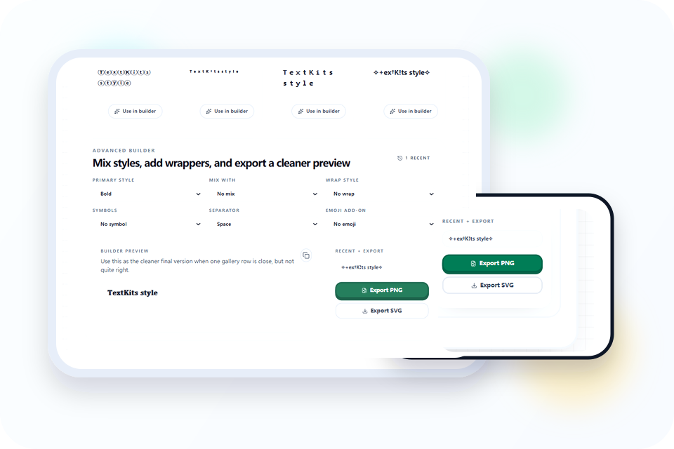
Mix styles, add wraps, change separators, or attach an emoji after the main style already looks readable on its own.
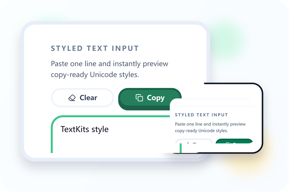
Copy one style for a fast paste, copy all visible rows for comparison, or export a preview if you also need a lightweight graphic.
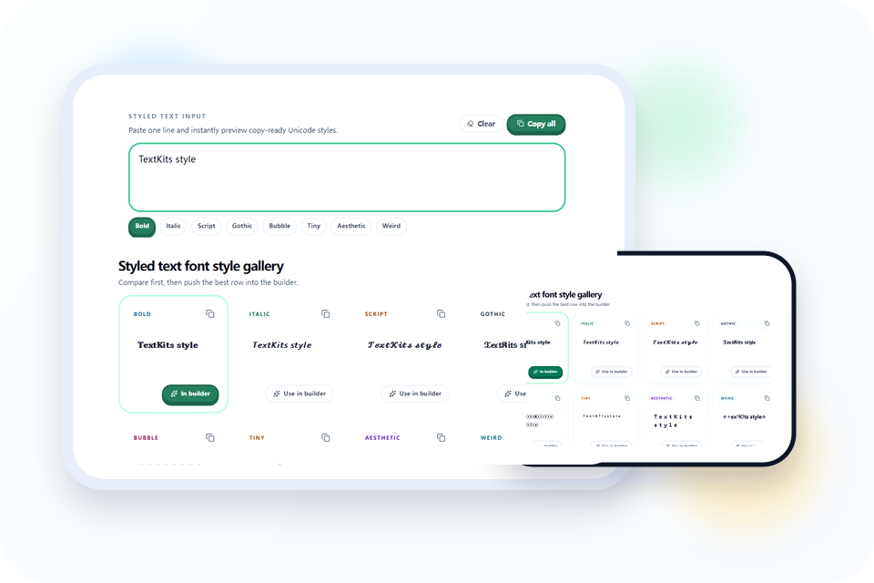
A lot of styled text font style pages are just long lists of random outputs. This one is more practical because the gallery starts with clean style families that users already recognize: bold, script, gothic, bubble, tiny, aesthetic, and weird. That makes the first decision faster, especially when you need decorative text for a real profile field instead of a novelty screenshot.
It also keeps the tool section ahead of the copy. You type once, compare several Unicode shapes immediately, and only move into the builder when a row feels close but not finished. That is a better workflow for fast social edits, short promotional lines, and name styling where speed matters as much as appearance. If you only need a bold text copy paste workflow, use the dedicated bold page first. If you want a heavier blackletter finish, the Old Timey Text Generator is the better next stop.
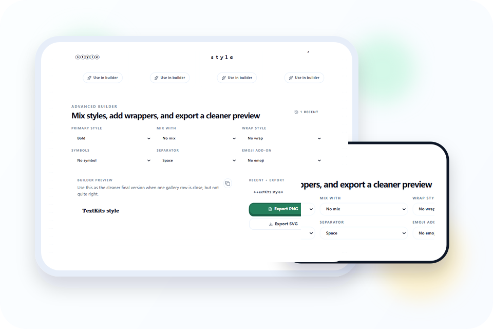
The builder is where the result becomes more deliberate. You can keep one strong primary style, mix in a second look, or add lightweight wrappers and separators without rebuilding the line from scratch. That matters when the first gallery result is almost right but still needs a cleaner rhythm or a bit more personality.
Because the controls stay compact, the page still works well on mobile. You are not forced into a heavy editor just to add sparkles, spacing, or a cleaner delimiter. For short bios, gamer tags, and headline-like text, that balance between control and speed is usually enough.
Decorative Unicode can look great inside a generator and still fail once it lands in a real app. That is why preview matters. You can compare the raw gallery rows, build a cleaner version, and then copy or export the result with less guesswork about what the text is supposed to do.
This is also where styled text stops being cosmetic and starts being functional. A cleaner final line is easier to trust in a caption, display name, or callout. If the goal is communication first and decoration second, the preview step saves time.
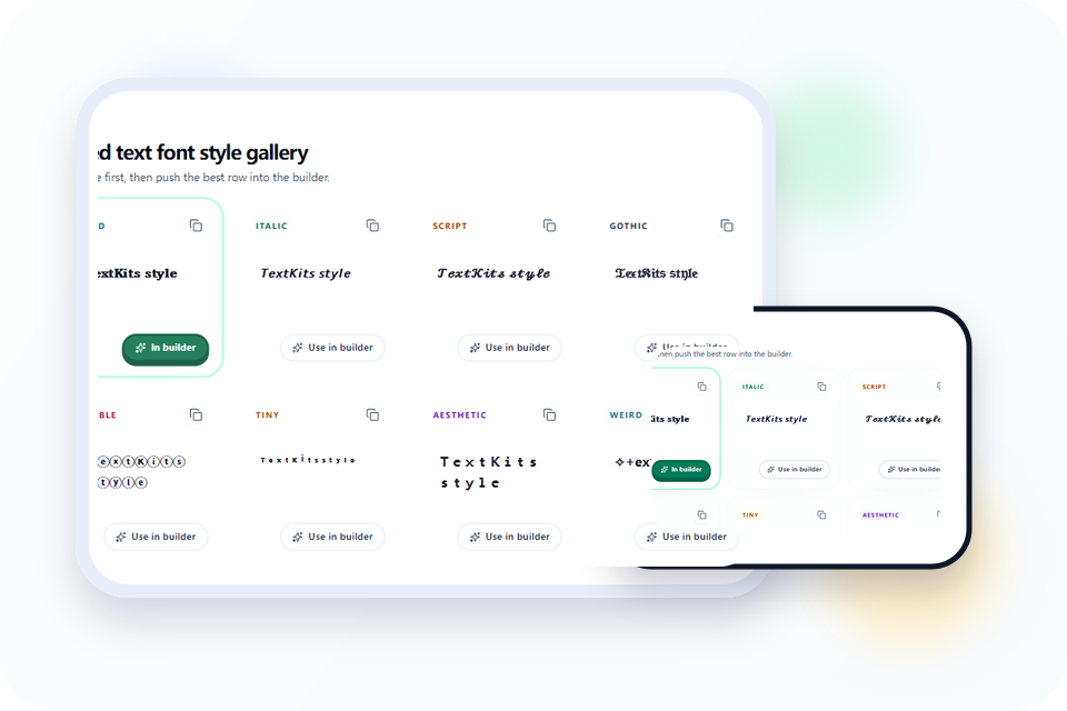
If the line needs to stay clear at a glance, start with bold, bubble, or fullwidth-style aesthetic output. These options keep the shape of the original word more intact, so the styled text still reads cleanly inside usernames, bios, and short labels. Script looks elegant, but it is usually better for slower reading than tiny interfaces.
A simple rule helps here: the smaller the final display area, the less decoration you should add. You can always layer extra symbols later, but once the core letters become hard to scan, no wrapper or emoji will fix the result. If the main job is just bold emphasis, Bold Font Free Copy Paste is the more focused converter. If you want a blackletter-heavy direction instead of a mixed style gallery, the Old Timey Text Generator is a more focused next step.
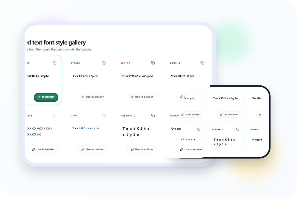
People looking for square-style text often do not need literal square blocks. They usually want a more geometric look that feels boxed, rounded, structured, or evenly spaced. Bubble styles, cleaner separators, and wide aesthetic text can cover that need without leaving the main styled text workflow.
That makes this page a good first stop when you want structure without turning the result into an image. If the goal is decorative copy that still behaves like text, staying in Unicode is more flexible than designing a graphic from scratch. If you need a stricter boxed layout or printable tiles, the Boxed Text Font page goes further in that direction.
The easiest way to avoid cleanup headaches is to keep your source line plain, generate only as much styling as you need, and avoid piling on extra symbols that make the text harder to scan or reverse later.
If you later need to reverse decorative output, the convert this font to normal page is the right follow-up. Together, the two tools cover both the forward styling step and the cleanup step.
Mobile layouts punish long decorative lines faster than desktop layouts do. Keep the phrase shorter, choose one dominant style, and trim unnecessary wrappers if the letters start to blur together. A styled text line that reads instantly on a phone is usually more useful than one that looks elaborate for only a moment.
It also helps to test in the destination app right away. Some platforms reduce spacing, clip unusual characters, or change line height in small text fields. Preview on the page, paste once, and step back to the cleaner option if the result feels crowded.
Try a nearby TextKits tool when you want a different copy-ready format, display style, or text effect.
Copy cursive Unicode text or download calligraphy images.
Copy tiny text, small caps, superscript, and subscript Unicode styles.
Turn plain text into focused bold Unicode results for bios, captions, and display names.
Restore fancy Unicode, flipped, and decorative text back to plain text.
Copy boxed text variants and print classroom-ready boxed letter sheets.
Common questions about copying styles, keeping text readable, and converting back to plain text.
Paste one line and instantly preview copy-ready Unicode styles.
Compare first, then push the best row into the builder.
𝐓𝐞𝐱𝐭𝐊𝐢𝐭𝐬 𝐬𝐭𝐲𝐥𝐞
𝘛𝘦𝘹𝘵𝘒𝘪𝘵𝘴 𝘴𝘵𝘺𝘭𝘦
𝒯ℯ𝓍𝓉𝒦𝒾𝓉𝓈 𝓈𝓉𝓎𝓁ℯ
𝔗𝔢𝔵𝔱𝔎𝔦𝔱𝔰 𝔰𝔱𝔶𝔩𝔢
ⓉⓔⓧⓣⓀⓘⓣⓢ ⓢⓣⓨⓛⓔ
ᵀ ᵉ ˣ ᵗ ᴷ ⁱ ᵗ ˢ ˢ ᵗ ʸ ˡ ᵉ
TextKits style
✧+ex†K!ts style✧
Advanced builder
Builder preview
Use this as the cleaner final version when one gallery row is close, but not quite right.
𝐓𝐞𝐱𝐭𝐊𝐢𝐭𝐬 𝐬𝐭𝐲𝐥𝐞
Recent + export
Copy or export a builder result and it will show up here for quick reuse.